A4, Laminated, Beloved: The Quiet Genius of the Local Takeaway Menu
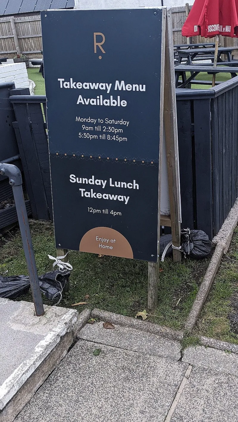
Photo: Jaggery , CC BY-SA 2.0, via Wikimedia Commons
There is a menu on a fridge door in almost every British home. It is probably A5, probably laminated, and probably has a corner curling up like a dry leaf. The phone number has been rewritten in biro because the printed one is wrong, and the photograph of chicken tikka masala has the saturated glow of a picture that has been photocopied twice and emailed once. It is not stylish. It is not on brand. It is, in its own stubborn way, one of the most honest pieces of design in the country.
The laminate is the medium
We tend to talk about design as something that happens in studios, with grids and style guides and a deck of options. The takeaway menu happens in a back office, on a USB stick, at ten past midnight. A family sits around a laptop and argues about whether the new price for a large doner should be £9.50 or £9.99. Someone’s cousin has a photo of the shop front from 2018. The printer on the high street says they can do 500 for a decent price if you supply the artwork, and the artwork is a Word document with a clip-art chilli in the corner.
Print-shop owners will tell you the same story up and down the country: the files arrive in every format except the one you asked for. There are phone snapshots of handwritten price lists. There are PDFs that are really photographs of a screen. There is always at least one menu where the text has been stretched to fit the box, so the letters look like they have been on a long walk. And yet the finished object does its job. It survives the journey home in a plastic bag. It wipes clean. It can be read by someone standing in a doorway with a coat on and a phone in the other hand.
Typography by committee
The typographic choices are easy to mock, and people do. Comic Sans, Papyrus, Impact, Brush Script. Red and yellow, because red and yellow apparently mean “food” to the human brain. A starburst sticker that says FREE POPPADOMS in a font that looks like it was designed for a school fête. But mocking misses the point. These choices are not naive; they are functional. They are signalling. A sleek sans-serif on uncoated stock might say “small plates and natural wine”. A rainbow gradient on a glossy flyer says “we are open late, we are affordable, and we will not judge you”.
The menu is also a document of migration and local economy. On one high street you can find a Bangladeshi curry house menu with a font lifted from a 1990s wedding invitation, a Turkish grill with a photo of a kebab the size of a forearm, a Chinese takeaway with a calendar on the back, and a Polish deli with a handwritten note about pierogi. Each one is a small piece of graphic history, made by people who did not set out to make graphic history. They set out to be found.
The menu is a map of the high street
If you want to understand a British town, don’t just look at the shopfronts. Look at the menus in the window. They tell you what people are eating, what they can afford, and who is doing the cooking. They tell you which businesses are new and which have been there since before you were born. They tell you where the nearest free parking is, because someone has added it in marker pen. They tell you that the owner’s name is Mehmet, and that he recommends the mixed grill.
Designers often talk about “user journeys” and “frictionless experiences”. The takeaway menu has been doing that for decades with none of the vocabulary. It knows you are hungry, tired and probably not wearing shoes you would go outside in. It puts the phone number at the top, the opening hours at the bottom, and the prices somewhere in between. It does not ask you to scan a QR code and create an account. It does not want your email address. It just wants you to order a bag of chips.
The photograph that tells the truth
Then there is the food photography, which deserves its own exhibition. The over-lit plate. The blue rim. The sprig of parsley that has been placed with the care of a museum curator. The same stock image of a pizza appearing on three different menus within a mile, like a local celebrity. The gap between the photograph and the thing that arrives at your door is part of the contract. You are not buying the picture; you are buying the promise. And the promise is not perfection. The promise is: this will be hot, this will be filling, and this will cost less than a round of drinks.
There is a particular honesty to a menu that has been updated with a sticker. The old price is still visible underneath, a ghost of inflation past. A new item has been added in a different font because the design file was lost. A handwritten note says “no delivery on Mondays”. These are not errors. They are evidence of a living business, adjusted in real time, by people who are too busy cooking to care about kerning.
The archive we throw away
We keep menus in drawers, under the cutlery, behind the takeaway leaflets that came through the door. They are designed to be disposable, and mostly they are. But they are also an archive of taste, economics and typography that rarely makes it into the design history books. A menu from 1998 can tell you what a mixed grill cost before the euro, before Deliveroo, before everyone started calling things “artisan”. It can tell you which fonts were available on a home computer. It can tell you that someone once thought a cartoon chef holding a giant fork was the height of sophistication.
Some local archives and museums have started to collect them, but most end up in the bin or the recycling. That feels like a loss. Not because every menu is a masterpiece, but because they are a record of ordinary design doing ordinary work. They are the visual equivalent of a market stall: loud, crowded, slightly chaotic, and entirely human.
What the designers miss
A branding agency would look at most takeaway menus and see a hundred problems. Too many fonts. No white space. Inconsistent margins. A colour palette that looks like a traffic accident. But the brief was never “make it beautiful”. The brief was “make it clear, make it cheap, make it ours”. And on those terms, the menu is a success. It is legible in bad light. It fits through a letterbox. It has the phone number in three places. It has a picture of the owner’s kids on the back, because why not.
The next time you take a menu off the fridge, look at it properly. The laminate is peeling. The prices have been changed by hand. The font is doing something strange with the letter ‘a’. And somewhere behind all that is a family, a printer, a high street and a very long evening. It is not design history as we usually tell it. But it is design history all the same.